Narrating Visualisations

I have chosen the Environment as my topic to base my visualisation assignment on. The broad question I am asking is, Is there a direct correlation between Climate Change and Precipitation? I will be researching and visualising if greenhouse gas emissions have any effect on the level of rainfall in Cork between 2010 and 2012.

I gathered all my statistics from Statbank, from the Environment and Climate section. At first, I tried downloading the CSV file provided, but when I loaded that file into my chosen visualisation platform, RAW, the titles were all over the place, as if the data was not entered correctly by the creator. I decided to enter the data manually into Excel and extract it as a CSV file. RAW is a simple and effortless platform to navigate, providing a drag and drop option to submit my CSV file. I particularly liked using RAW over other platforms such as Gephi, because you have the option to choose from many charts and graphs and the user interface is very appealing.

First, I used the data I gathered regarding the rainfall, every month from 2010 to 2012, and chose to visualise it using the Circle Packing chart.

Rainfall 2010-2012 Cork

Screen Shot 2016-04-05 at 12.46.43

This image is very appealing to the human eye, in contrast with the factual data that I had to rewrite myself in order to create this colourful visualisation. I organised it so that the amount of rainfall in millimeters was displayed alongside the year, and each colour represents the month of the year. The bigger the circle, the more rainfall. I have also added an image of each month corresponding with it’s designated colour. This was not available to download like the Circle Packing image, I had to screenshot it, so you as a reader could determine the month involved. However, if you were entering your own data in RAW, this is available to you on their page. As you can see from my Circle Packing visualisation, June 2012 seems to have had the most rainfall in the entire study, following with August 2012 and October 2012. So what we can derive from this already is that 2012 was a significant year with reference to an increase in rainfall.

I also chose to represent the same data using the Alluvial Diagram in RAW. It proved, for me, to be a more readable graph. It has the months in order of most rainfall, and also the years. Again, we can see June at the top of the graph following a chunky blue wave. August stands out for us also in it’s colour matching, as we can follow the red wave directly to the year 2012.

Rainfall Img. 2

On the right hand side, the graph is in the order of showing the most rainfall, and descending in scale from there. Scanning your eyes from right to left you can link up the amount of rainfall with its specific year and then follow it back to its specified month.

What I can determine from viewing these two graphs, is that as the years went by, rainfall increased in Cork from 2010-2012. Being unsure of what external factors could cause this increase, I looked towards climate change, and the problem of greenhouse gas emissions affecting our climate.
Emissions

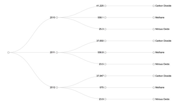
The main greenhouse gases are Carbon Dioxide (CO2), Methane(CH4) and Nitrous Oxide(N2O). In Ireland, N2O and Methane stem from the agricultural sector. CO2 are emitted through the burning of fossil fuels such as oil, coal, gas and peat. It is also emitted through deforestation and urbanisation. I also used data from Statbank to gather data about the Greenhouse Gas Emissions in the years 2010, 2011 and 2012.

I created a CSV file for this data and uploaded it to RAW. I chose the Cluster Dendrogram chart to show my visualisation of my gathered data in regard to the greenhouse gas emissions in Ireland from the year 2010-2012. It displayed that more emissions were emitted in 2010 than in 2012. I’m no weather specialist, so I can’t determine whether gases emitted in 2010 could create the horrendous weather that we had in 2012, but looking at these graphs, that’s the only conclusion that I can come to, other than the idea that maybe greenhouse gases are not the reason for such rainfall.


After reading the Environmental Protection Agency’s factsheet, I am convinced that climate change does have an impact on precipitation, and does correlate with my findings. It states that “impacts of climate change in Ireland include: an increased likelihood of river and coastal flooding” and “more extreme weather conditions including rainfall events”. It’s shocking findings tell us that “Agriculture is the single largest contributor to overall emissions at 32%”.

I also read an article published in 2012, which declares that “global greenhouse gas emissions increased the risk of flood by up to 90 percent”.

I am certain that these visualisations prove helpful in trying to compare and contrast particular data, however, I am still unsure whether both my data sets link up enough to support my hypothesis.


References:

Community-engaged project: Zooniverse

As part of my Digital Tools and Methodologies module, we were given the task to join the people-powered research platform that goes by the name of “Zooniverse”, choose between a number of user-generated content(UCG) projects that we were personally interested in, and participate and contribute as best we could within that project.

To understand and appreciate the different objectives that each project brings, I decided to pick three projects that appeared to contrast one another. The three projects that caught my eye were: Jungle Rhythms, Chicago Wildlife Watch and Galaxy Zoo.

Screen Shot 2016-02-21 at 15.46.28

The Process

The process I undertook for each project was fairly straightforward. Each needed a volunteer with a good eye to answer a few questions, alongside a photo associated with their field of study, or topic of said project.

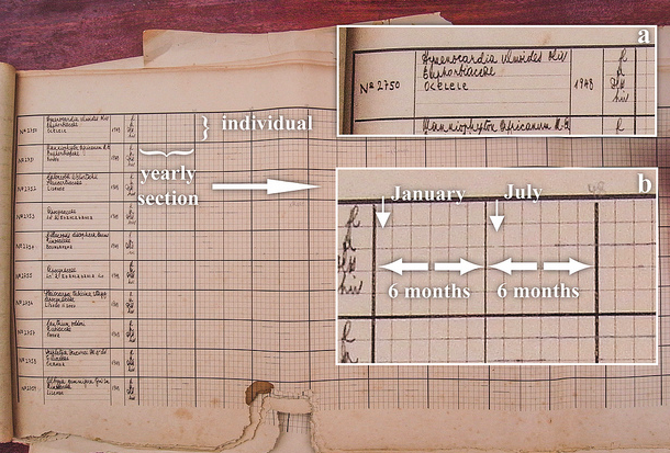
The project I began with, and the one I’m going to focus on in this post is Jungle Rhythms. The Jungle Rhythms project’s aim is to “try to link long term observations of tree life cycle events with weather data”, and this in turn will help specialists to understand the future of the tropical African rainforest. They are doing this by transcribing the handwritten table, that scientists stationed at the Yangambi research station in the Republic of the Congo created.

Screen Shot 2016-02-21 at 18.33.14

Summary Table

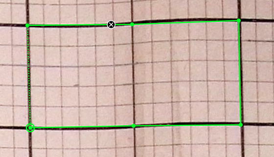
In the example I’ve placed above, we get something that looks like image (b). First of all, It asks us if the centre rectangle (the yearly section) is visible in the image displayed to us, and if pencil marks are present. Every time I repeated this process I was given a similar image so all my answers were the same. Answering “Yes” to this question, I am then met by another, but more interactive question: “Outline the centre rectangle (yearly section). Please make 6 marks total — four at the corners and two at the half-year points.”

Screen Shot 2016-02-21 at 19.06.35

Screen capture of the process

I found the next question a bit trickier, as the attributes were hard to distinguish, and some could even be dust or dirt on the transcripts. I was asked to “mark all hand-drawn pencil marks within the yearly section.” I had to mark solid lines with a red line and crosshatched lines in blue, (these indicate the presence of a life cycle event). If I came across a big X before hand written text, I was to mark it with a crosshair, (this indicates that a tree has died, or been removed from the study).

Screen Shot 2016-02-21 at 19.23.01.png

My finished result

When I completed this task, I was then given an overview of the answers I had given, and a link to talk about this specific image with others in the community, who were contributing also, if I was stuck on classifying it.

The Implications of my contribution

At the end of the FAQ on the Jungle Rhythms website, it explains what will happen with the processed data:

“After the completion of the project all data will be released under a Creative Commons Attribution-NonCommercial-ShareAlike 4.0 International (CC BY-NC-SA 4.0) license. This open source license guarantees open access to the data and derivatives.”

All of this data could in turn help researchers understand plant functioning that dates back to 1937. All of the information we provide them with from our contribution, will help them determine the dispersal potential and growth responses in a changing climate. There is an ongoing question of whether the rainforests are getting drier or wetter. According to this article, the African rainforests are getting drier as “scientists studying the trend say it’s likely to be due to natural fluctuations in the Indian and Pacific ocean temperatures which affect the climate.”

What I’ve learned & How I can apply this to my own work

I’ve learned more about the benefits of crowd-sourcing from contributing to these projects. I think that it is a completely underrated initiative, and I wasn’t aware of websites such as Zooniverse that help share these magnificent projects. I’ve also learned a lot about the processes of crunching all of this data from the various blog posts these projects have, alongside their website. From reading the blog about the process of Jungle Rhythms by Koen Hufken, It’s shown me that there’s a lot of work still to be done, even after the community has contributed.

One way of how I could apply these crowd-sourcing initiatives to my own work at the moment, would be through another module I am studying this semester. My team and I are assigned the task of creating a Data Management Plan for the Cork LGBT Archive. Part of this plan is gathering data, such as letters, images, video, audio. They have already been categorised into broad categories, but we would still have to narrow down on what information is specifically present in that data, to fully understand it. Having a crowd-sourced project set up would help the archive immensely with decreasing the work-load. Of course a review of what’s been contributed would need to be put in place, but ultimately the idea would be a great help to this project.


I enjoyed working on this assignment immensely, and the thought that I’m contributing to a good cause at the same time is very gratifying. I look forward to using this crowd-sourcing initiative in the future to create my own UCG project, or by continuing to contribute to others.


Critical Review of Storify

In this review of Storify, a content curation platform, I will critically analyse how Storify works as a research tool and as a pedagogical tool. I will also give feedback on my initial thoughts on Storify, after using it to curate content for another assignment of mine.


Launched in September 2010, Storify was initially aimed at journalists, people who are used to hours and hours of researching to find the exact information from a credible source to create the perfect story. Storify cut down those hours, and made the process simple and easy for those aspiring to be the next Anderson Cooper. As time goes on, Storify seems to be increasingly applicable in the classroom as it “helps teach students how to contextualise the streams of social media information” (Fincham, Kelly, 2011). Co-founder of Storify, Burt Herman, describes it as “21st Century wire posts that are dynamic stories that can be embedded across the web”. This platform is the future of media, and students and teachers are being encouraged to get on board with this idea as soon as they can. Curation means to merge traditional reporting with information transmitted from social media. Students now have the opportunity to delve into this activity of curation just like journalists do. The only thing they need is a Twitter and Facebook account to connect with their Storify account to be able to search. Students can now become curators, “someone who takes an inordinate mass of material, and turns chaos into order, or in a more recent slang, turns “noise into signal” “ (Guerrini, Federico, 2013). They have the opportunity to become independent storytellers, and use the vast information that they have at their fingertips to create something unique.


Some of the functions that Storify provides, will aid the average student in bypassing the everyday problems that professional journalists might come across. When searching for content through the many social media site search bars that are provided, Storify also offers the option to apply additional filters. The search results can be filtered based on whether the results have links, images, retweets and geographic location. It’s a way for students to sift through and gather material without having to do the old-fashioned research that’s impractical for a non-journalist. Herman advises students to use the user/list section to search for reliable sources first. Bill Keller, editor of The New York Times, had this to say about it – “Storify provides a filter function to filter out the poor content and unreliable sources. Students can use Storify to verify which accounts make sense. There are voices on Twitter that matter and Storify is a way of reaching them”.


Every image and text that is added to the student’s story is automatically attributable to the owner, so there is no need to worry about copyright issues. While using Storify myself, I even had the option to tweet a person, whose tweet I had embedded into my own story, to let them know that their tweet was displayed on my page.

What I found very interesting about the process of embedding information from social media platforms onto Storify was that, even if the original tweet, post, gif was deleted by the owner, it will forever stay on Storify. This platform copies over the data and stores it on their server.


A very useful feature that could be used in the classroom, is the option to comment on each paragraph and embedded element, and also share those elements on other social media platforms. This would be a great way for students to report on their peers work, and give their opinions and feedback on it, which then would engage the students in a scholarly discussion about their chosen topic. Of course, being able to post the final publication of their story on social media is a major feature, so it can reach many others with the appropriate hashtag, to encourage further debates.


What I found to be poor usability engineering regarding the Storify application, was the aggravating way that the cursor would jump back to the start of the paragraph if I clicked onto a different webpage. I found that when I came back to my Storify essay, fully rejuvenated with ideas, continuing from my unfinished sentence, that I was actually writing everything at the beginning of my paragraph instead of taking up where I left off.


Overall, I established that Storify is a great application for aspiring journalists of the Digital Age, using content curation at its core to create dynamic stories, that appeals more to the public and encourages scholarly feedback. Teachers are already getting their students involved in this curation platform to complete assignments, and to learn how to avoid unsourced opinions and speculation. Storify is a very professional platform, and I have no doubts that it will flourish in today’s society.

References:


Crowd-Sourcing and Impact in the Humanities

I read the article “More than a business model: crowd-sourcing and impact in the humanities” by Stuart Dunn, a lecturer in Digital Humanities at King’s College London.

Crowd-Sourcing –  “the practice of obtaining needed services, ideas, or content by soliciting contributions from a large group of people and especially from the online community rather than from traditional employees or suppliers”, as explained by Merriam Webster.

In the early days of crowd-sourcing, it was focused on furthering the aims of for-profit businesses. So anyone that had access to the internet, who had a lot of time and enthusiasm, were able to participate in design competitions, micro- tasks and distributed production. The aim of this was to build on the company’s status and help them out a little bit.

Dunn wrote that  “Crowd-sourcing was about the public having impact, and reaping whatever reward the project offered – money, or the prospect of winning it, prestige, seeing your design on the mass-produced t-shirt – and not the public being impacted.” The people who are who are helping to crowd-source projects, want the companies to collaborate with them, so both parties are impacted. A survey was done for this article, and the “Super-Contributors” to these projects answered that they want to be part of the conversation, not just the process. They mostly have a desire to be useful, and see what happens on the inside, rather than being limited to just providing info and getting a fancy prize for it. They wish to learn about the content and see how the projects are organised.

Dunn gives some advice to ensure a “reciprocated impact of a humanities crowd-sourcing activity”.

  1. Not every question or problem you come across will  be susceptible to crowd-sourcing as a solution.
  2. Small groups of people have done the most valuable amount of work by sustaining their intellectual engagement throughout the project.
  3. It would be a good idea to have a contributor’s forum so that mutual problem solving is an option, by having support discussions put in place throughout the forum for particular projects. This helps to create a space full of non-institutional people working on your project, and also creates more exposure for the discussions about your project on a social media platform.

Google have recently open-sourced TensorFlow, a software library for machine learning. They hope people will contribute to the code to make their software even better, giving people a chance to make a change in machine learning.

You can find Stuart Dunn’s article “More than a business model: crowd-sourcing and impact in the humanities” Here.

Here is the TensorFlow website, where you can find more info on the project itself and why Google chose to open source it.

On Photography

I recently read “On Photography” by Susan Sontag, and I found it quite an enjoyable read. You can also read it here.

There is much to say about photography after reading the first chapter  “In Plato’s Cave”. Sontag reveals that writings, paintings and drawings about someone or an event is an interpretation, a visual statement. She claims that photography isn’t a statement about the world, it’s just pieces of it that anyone can acquire. It’s a beautiful art that surfaced around the late 1830’s, and since then most of the earlier photographs taken have been mislaid or torn, because they need to be preserved to last long.  Hence why photos were printed in books, but Sontag believes that because of this, the photo loses it’s quality.

Since photos are found almost anywhere now, in films, galleries and books, there is confusion of how to view the images correctly. I believe there is no wrong way to view an image, but in Chris Marker’s film “Si j’avais quatre dromadaires “(1966), he tells exactly how much time to spend on each photo, and the order he wants you to view them in. He want’s the viewer to gain in visual legibility and emotional impact, and I think this is a beautiful thing.

How is it that if someone tells us something, most of the time we don’t believe them unless they have photographic evidence? Well this is another point Sontag makes, that photographs show a form of truth, evidence. When we want to travel to another country, we need a passport, and that passport needs photographic evidence, signed by the civil force of a state, to prove that it’s actually you. Same goes for trying to get into a club that’s over 18’s. To prove you’re of age, you need an image of yourself  stating your date of birth. June 1871, the Paris Police used this method to catch murderers. Photography incriminates, but also justifies.

At the start of photography, much like the start of computers, it only had the Inventors and experts to use them, and they were expensive enough that only the rich could have them. No amateur could work it. Nowadays every amateur has a camera as part of their smartphone, and has the power to capture everything and anything they want. Although sometimes, this is not a good thing.

Photography has become one of the principal devices for experiencing something. Giving an appearance of participation. Most people can’t go anywhere nowadays, without getting the urge to show everyone what they’re experiencing. Like those people who have over 100 seconds on their Snapchat story of: A concert, a night out, or plain old “banter”. You know who you are.

Tourists using this method of taking pictures of everything while on holiday, has been found to be a method of working, while not working. In this day and age it is unnatural to go away without having a camera. It calms them to take pictures of the beautiful scenes rather than take it all in themselves. They put the camera between themselves and the remarkable scenery.

Sontag states that photography holds a form of Immortality. After the event ends, the picture still exists. This is how history can resonate with  us, we feel empathy towards horrific images of events that have unfolded in another country, or era. For example, the images of the Bergen Belsen and Dachau concentration camps. The writer describes of how seeing these images at the age of 12, changed their perspective on everything.

I love taking photographs as way of documenting my life, like everyone else really. We often take this luxury for granted. After reading On Photography, I know I’m going to be more aware in the future by noticing these aspects of photography, and maybe be a little wary of what I post.

WARNING: Disturbing Images. Here are the images of  the Bergen Belsen and Dachau concentration camps.

“A Cyborg Manifesto” – Donna Haraway

My immediate reaction to Donna Haraway’s “Cyborg Manifesto” was that of complete perplexity. Her style of writing and language was hard to grasp, but throughout reading it, I seemed to be able to piece a few things together to get the big picture. The big picture mainly being, that the cyborg/human hybrid is and will be the next organism in overcoming racism, sexism etc. and destroying labels regarding gender, religion and history.

Now saying that, Haraway did only start writing this in 1983, and it was published by 1985 for the world to see, so to say she was a woman ahead of her time, is an understatement, as this women almost predicted the future. As a child who grew up in the Digital Age, it’s easy for me to comprehend that there would be such forms of Artificial Intelligence created, but it is peculiar to see such ideas being thought of back then.

I was confused as to what this whole cyborg idea had to do with socialist feminism, but Haraway makes it clear that cyborgs don’t judge each other based on ethnicity, beliefs ( feminism) or stereo-types. So to become a cyborg, means, to become acceptable to all, and this is the step forward that she wants us to take. Haraway’s belief of feminism is that it should be about equality , where both man and woman are equal, not the woman trying to seek a place higher than the man. Cyborgs, according to Haraway, think in terms of equality.

Although, I do have a concern with this. Haraway’s defines a cyborg as being ” a cybernetic organism, a hybrid of machine and organism, a creature of social reality as well as a creation of fiction”. The new age machines cannot be considered as just appearing artificial anymore. There is no boundary between natural and artificial. Cyborgs lose some aspects of what makes us human, and even she describes them as “monstrous”, leading us to believe that they could do more harm than good. The human traits that are removed, are removed to ensure control.

In this article I found on sexism in the world of AI, it describes how it’s mainly men are building AI’s, and the effect this will have won’t be a good one if we don’t have a woman’s input. It explains how Artificial Intelligence research has drifted from the focus of how technology can improve people’s lives. This is Haraway’s goal, but we seem to be straying from it. “Many women are driven by the desire to do work that benefits their communities, Men tend to be more interested in questions about algorithms and mathematical properties.” [Marie desJardins, 2015]

“Robotics and artificial intelligence don’t just need more women—they need more diversity across the board”  [Sarah Todd, 2015]

Inside the surprisingly sexist world of artificial intelligence – Sarah Todd, 2015.

Marie desJardins, a professor of computer science at the University of Maryland, Baltimore County, whose research focuses on machine learning and intelligent decision-making.

Critical Discourse in Digital Humanities

I recently read the article “Critical Discourse in Digital Humanities” by Fred Gibbs. The three main points he has made are :

1. “Digital humanists have not created an effective critical discourse around their work.”

2. “We need more theoretical and practical rubrics for evaluating digital humanities work.”

3. “Digital humanities work requires a different kind of peer review to produce effective criticism.”

  • Firstly, he explains how digital humanities is very different from the humanities, which leads to the need for different ways of evaluating work that humanists are unfamiliar with. A critical discourse has not been made for digital humanists to criticise each others’ work. The digital humanities community has been supportive, and slow to appear unwelcoming. Although Gibbs claims we do criticize our peer’s work, it’s a public opinion that is most useful, from those outside of the digital humanities. We need to explain what is good, and what is not good and why.
  • Secondly, Gibbs explains that a critical discourse needs to be concerned with both interpretation and evaluation. He doesn’t want to see an astounding visualisation that has no meaning behind it. He also explains how the ways that old critics criticised, are needed along with the ways of critics nowadays in this new critical discourse that we are seeking. Nowadays we judge something whether it is good or bad. Back then, things were criticised based on “knowledge, disinterestedness, love, insight, style.” Gibbs tells us we are better off to evaluate things according to Barbara Herrnstein Smith, by  integrity, boundaries, coherence, features, qualities, categories to which it belongs and properties that make it what it is. So, he outlines a few of his own categories that he believes should be the criteria for critical discourse:   Transparency – to see if we can really understand what’s happening. Resusability – is there an option to export this data so other digital humanists can apply it to their projects. Data – so that it’s visible to the world and not hidden, and can be tested. Design – the medium is the message, but the decisions behind it count also.
  • Lastly, he explains that digital projects need to be published publicly for it to receive the relevant scholarly discourse. Gibbs is saying that we need a whole broader audience to do the criticising because digital humanities is a broad subject that embodies interdisciplinary practices that can’t make it alright to use the same old models of critique. The most expressive critique is one that discusses the unique characteristics and style of the creator that is reflected from their work.

This was an interesting read as a student studying Digital Humanities, it showed me how I can effectively criticise my own work, and my peer’s work so we can improve it according to the criteria stated above.

Deploying Gallery on to my Server

For my fourth Digital Humanities assignment, the goal my class and I have, is to familiarise ourselves with the deployment of a web service on to our server space. This in turn, should help us appreciate all the work that goes into creating such applications and understand how they work.

Firstly, I had to purchase server space from a website called Reclaim Hosting. It was 25 dollars(which was around €23 for me), and that was the cost for a student & individuals annual subscription.

From the Reclaim Hosting cPanel, I searched through a series of web applications, trying to find what looked appealing. I decided to choose from the Photos and Files section, and searched through each application’s description to see which one suited my taste the best.

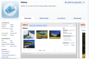
In the end I decided to go with Gallery, as it seemed simple and attractive. The showcase section on their description page helped me decide to go with that application also, because it showcased some websites that are powered by Gallery. Other applications didn’t have this available so it appealed to me that Gallery did. It seemed professional.

Screen Shot 2015-04-10 at 13.24.12

What is the purpose of the service or application you have chosen?

The purpose of Gallery is to provide a space for people on the internet so that they can add photos and make albums and share these with other users. The company describes it as “the next generation of open source photo sharing web applications”. Comments are also enabled, so this gives the users a chance to comment on each others posts.

Why are you interested in it?

I’m a very visual person, so anything with images are an instant appeal. Gallery is almost like any photo sharing application out there ; Facebook, Pinterest, Instagram, etc. And since these web service’s have done so well around the world, I think it’s safe to say that people love to share photos with everyone else. Whether it be “selfies” or a beautiful landscape, or a moment that’s been snapped with the perfect timing.

How is it or might it be applicable to something you may do in the future? 

I might transform this web service into the most amazing website ever. Who knows? I certainly don’t. But I do know that I have this at my fingertips now, and the choice is endless. I like the idea of an open source photo sharing application on my website. It could be one part of the many areas I will have on megandesmond.com ( Don’t judge, I couldn’t think of anything else! ). People could share photo’s of themselves with my product, the nosePhone, that transmits smells through text! Or people could be joining in on my exciting journey of travelling the world by sending in their images of them exploring! The list is endless.

What steps were involved in the deployment process?

To be honest, the deployment process of this tool was the easiest part of this whole assignment ( Giving away my money being the hardest part ). All that was needed to do was to click on the “Install this application” button, and you were good to go! It’s only 16MB so no harm done there. I clicked onto my webpage megandesmond.com, and the homepage for Gallery was set as my webpage. I logged in, and it named me as the Gallery Administrator ( I felt very fancy ).

What technologies are used and had to be configured to deploy your chosen application?

I had everything I needed, working with a OS X Yosemite Macbook Air. Although, when I go into the option to add  photos an alert comes up to tell me that “Movie uploading is disabled on your system, Help!” I clicked on the help button and it told me that, to upload videos my system “needs the FFmpeg toolkit to extract thumbnails and size information from them”. You have the option of downloading it, but I didn’t feel the need to as images are all I’m interested in at the moment.

Who would benefit from access to such a service/application?

Well firstly, I would benefit from it, in regard to what I mentioned earlier with it being applicable to something I may do in the future. But I also think anyone that has an interest in photo sharing would benefit greatly from it. The layout isn’t as clean and pristine as the almighty Instagram, but it certainly has room to improve, and the potential to be a great application.

I’ve learned a lot from partaking in the deployment of a tool on my newly owned web server. Now I know for myself what goes on behind the webpages, rather than just being the user than signs in, I’m now an Administrator!

Data Visualisation of “La Francophonie”

The Arts subject I am studying as part of my course is French. I love to learn more and more about the french culture everyday, and La Franchophonie is a big part of France’s culture.

French is the 9th most widely spoken language in the world, and together with english, is the only language spoken on all five continents. It is the 3rd most widely used language on the web.

I used text from the Orginisation Internationale de la Franchophonie  ‘s website. The text I used in my data visualisation graph are the names of countries that are member states and governments of the Franchophone. There are 57 member states and governments, and 23 observers.

The data visualisation tool that I used to display this information was IBM’s Many EyesI found this tool to be very professional out of all the tools I had researched. Eg: Voyant, Wordsift and Wordle.

Screen Shot 2015-03-21 at 14.19.19

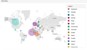
I used the world map display option in my visualisation. I copied all of the countries names, and I pasted it into the text box.  After I chose the visualisation option I wanted, it processed the words that had been entered and it appeared perfectly as I had wanted it to. Various circles were added all over the map to display the countries that were named, and in different colour too. What I liked about this tool, is that on the right hand side of the page it also displayed every word entered and the colour next to them, so you have an option to check what country it is.

It’s very visual and that’s why I wanted to experiment with the countries of La Francophonie because it’s something, as a french student, that I should be aware of. Already, I have learned much more about this text than I would have if I had just read it, because reading a list of something is not how I would effectively learn the list. If I had a world map in front of me, I would confidently be able to point at a few countries that are part of the Francophone thanks to this visualisation.